 Celebrating 40 years of excellence | Ranked among the world’s top 100 language service providers by CSA Research
The Challenges of Multilingual Typesetting
After investing time and money into a new campaign, you’ll want the foreign language versions to have just as much impact as the original. It starts with great translation. But getting the words right isn’t enough—your materials also need to look good and read legibly. This is where multilingual typesetting comes into play.
What Is Multilingual Typesetting?
Multilingual typesetting entails placing and formatting translated text into a graphic or design program such as InDesign.
While this might sound straightforward, it’s trickier than you might think. Each language has specific rules and peculiarities that need to be solved so it will read naturally. If handled by someone without an in-depth understanding of a particular language and its challenges, there’s a lot that can go wrong.
Typesetting Challenges
Consider these important factors when setting translated text:
- Fonts. First and foremost, set text in fonts that render properly, read legibly, and possess all the characters and accent marks needed for that language. Someone who is not fluent in a specific language or experienced with multilingual typesetting will have difficulty identifying whether a language is being properly rendered.
- Line Breaks. The rules that guide line breaks are not obvious in all languages. In Polish, single-letter words cannot be placed at the end of a line of text. In Thai, among other languages, spaces cannot be used to identify where one word ends and another begins. Without speaking the language, it can be hard to determine where to place appropriate line breaks.
- Punctuation. Languages differ in the ways they handle punctuation. For example, there are times when a decimal will be used rather than a comma. Some languages, such as Arabic, do not hyphenate. Other languages, like German and Russian, use hyphens frequently, but follow specific guidelines defining their placement.
- Alignment. Languages have different rules when it comes to alignment. For example, Chinese text must be justified on both sides.
- Italics. A number of languages, such as Japanese and Armenian, do not have italics.
- Capitalization Rules. Capitalization of words and headings also varies. Some languages, such as Arabic and Korean, do not have capital letters at all. This lack of letter casing means that typographers must find different solutions for treatments such as drop caps.
Text Expansion and Contraction
In some languages, it takes more space to say the same thing as in another language. Text expansion occurs when the number of characters in the target language outnumber those in the source language. It is often caused by differences in sentence structure, grammar, or the way terminology is used across languages. Word length also impacts expansion or contraction. For example, even though an English-into-German translation may produce a similar number of words, the translation will take up more space, because German typically uses more long, compound words.
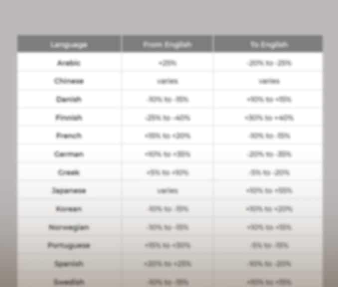
Rates of expansion and/or contraction vary widely. Translating from English into languages such as Spanish or French can result in 20-25% expansion, while German may expand as much as 35%.
Other languages take up less space in translation. Chinese, Korean, and Japanese will usually contract, although the amount may vary significantly. However, these languages may require more vertical space. Their characters are more complex than those in the Latin alphabet and require more space in between characters. Horizontal expansion can occur if the space between the lines needs to increase to fit the characters.
Text Expansion and Contraction Chart
We've created a PDF to provide guidelines for text expansion and contraction. Along with expansion/contraction ratios, we offer tips to help you prepare content for translation and typesetting.
Download Now"*" indicates required fields
Bidirectional Type
Arabic, Hebrew, and Farsi are right-to-left (RTL) languages, meaning that text flows in that direction rather left to right as in English. To properly set a document in RTL languages, the entire layout needs to be reversed into a mirror image of the original. It’s easy to see how flipping a layout can create an assortment of problems: Some images may not work in reverse or placement on the page may need to be adapted. Tables may require re-working so the flow of information begins with the right-hand column.
Get in touch!
Reach out to discuss your next typesetting project with a member of our team.
The Complexities of Translating the Arabic Language
Arabic is an incredibly complex writing system with its own set of challenges. Letters are joined to each other and take different forms depending on context. While there are 28 letters, most have four forms according to their position in the word: beginning, middle, end, or isolated. This creates an enormous number of unique combinations.
Each character is not only defined by its shape but also by placement of dots above or below. Two characters that have the same shape may have completely different meanings depending on dot placement. The relation of the dots to characters must remain accurate even if the fonts are changed. Appropriate spacing must be used between different letterforms. As an added challenge, terms are sometimes intentionally left in English and written with Latin (or Roman) characters, e.g. brand names. A typesetter must factor those words seamlessly into the layout.
The Chinese Language
In Chinese, the character sets are massive, made up of several thousand symbols. When rendered electronically, Latin alphabets and most other languages use a single byte of computer memory to create each character. Due to the complexity of Asian languages, new encoding systems were implemented in which each character occupies two bytes of information, referred to as “double-byte” or “multi-byte.”
The flow of text can also be challenging to fit into a layout designed in English. There are two forms of written Chinese, Simplified and Traditional. Both can be written horizontally, left to right, like English. Traditional can be written left to right, or vertically from top to bottom, starting from the top right of the page. Sometimes, both directions are used within the same document. Japanese and Korean can also flow horizontally, vertically, or both.
Featured Services
Learn more about…
How Does Multilingual Typesetting Work?
For starters, it’s advisable to use the same language service provider (LSP) for translation and typesetting. This approach is affordable, increases turnaround time, and reduces the chance for error. The process is straightforward.
An LSP will work directly from your design files, such as InDesign or Illustrator. The text is extracted and translated, then edited by the linguists who have been selected for the project. At this point, a client may opt to conduct a post-translation review. This step entails someone in-house confirming that the materials convey the company’s unique voice and brand. Any changes recommended by a reviewer are validated by the translator to ensure the translation is accurate, no errors were introduced, and the meaning of the text has not been altered.
Next, a multilingual typesetter imports the translated and edited text into the working design file.
- Professional typesetters have the skills to identify improperly rendered text and make the necessary corrections.
- They will ensure that all text displays correctly and fits properly within the layout. This may require adjusting text boxes, font size, leading, or other page elements to accommodate expansion or contraction.
- They will identify and correct any layout issues, such as italics, underlining, or soft line breaks.
- A good typesetter will make sure to follow standard conventions, optimize readability, and preserve the integrity of the original design.
After the typesetting step is complete, a final proofreading ensures that everything is correct and consistent across languages. Finally, the translated, typeset files are delivered, ready for print. Checks and balances are built into the process, and the entire team collaborates so that the final piece is completed successfully.
Layouts That Look Like They Were Created in the Target Language
All the materials you produce are a reflection of your company and your brand. Everything—design as well as language—must maintain a consistent look and feel. This attention to detail is why one should not underestimate the importance of professional multilingual typesetting.
Experienced typesetters with language and subject-matter expertise know how to adjust type to fit a layout and solve any problems that arise. Ultimately, a team of translation and typesetting experts make sure the final documents are both readable and accessible and look just as good as the originals.