 Celebrating 40 years of excellence | Ranked among the world’s top 100 language service providers by CSA Research
Fonts for Multilingual Typesetting
When text is set in different languages, many factors impact whether a layout ultimately looks natural to the reader. One critical component that can make or break the readability of a typeset, translated document is font selection.
It is the job of the typesetter to ensure that the right fonts are used so that the text displays properly. But many people are not aware of how these choices are made, or why some fonts are better than others when working across languages. In this article, we discuss issues that can arise in multilingual typesetting and provide a guide to reliable multilingual fonts.
What Is Multilingual Typesetting?
Multilingual typesetting is the process of placing and formatting translated text in a graphic or design program such as InDesign. Typesetters are responsible for making sure the text conforms to all rules for punctuation, spacing, and page set-up, while solving specific challenges presented by different languages.
Here are just a few of the ways conventions vary from one language to the next:
- Formatting such as bolding, italics, and underlining is not used in many writing systems, requiring different means for creating emphasis or calling attention to specific phrases.
- Languages such as Arabic and Hebrew are written right to left, while Chinese can be horizontal, vertical, or even bi-directional.
- Languages like French and Spanish require spaces before many punctuation marks.
- Some languages, such as Arabic and Korean, do not have lowercase and uppercase letters.
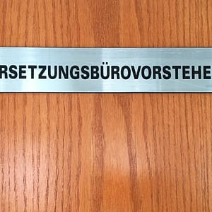
- Text can expand and contract relative to the source text. For example, translating from English into Spanish or French can result in 20-25% more characters, while German may expand as much as 35%.
- Languages also have different rules when it comes to alignment. Chinese text, for example, must be justified on both sides.
- Rules for line breaks may also differ. For example, in Polish, single-letter words cannot be placed at the end of a line of text.
Professional typesetters have the experience and know-how to adhere to different linguistic standards while presenting content in a manner that is clear, accurate, and visually appealing to the end user.
Fonts: An Integral Component to Branding
Font selection is an essential part of the design process. Fonts help establish the look and feel that runs throughout an organization’s materials, while communicating and strengthening brand identity. To effectively maintain a coherent visual identity, fonts must be used consistently across languages. But not all fonts support all languages, so it takes a certain understanding of the capabilities of each font family to set text reliably and identify appropriate substitutes when needed.
Multilingual Fonts
Languages use characters, glyphs, and accent marks, many of which are shared by various languages, some of which are unique. The terms are not mutually exclusive, but definitions for the purposes of typesetting are as follows: a character is a symbol representing a letter. A glyph refers to a symbol, shape, or mark that communicates a character. Examples of glyphs include the letter n, as well as the ˜ (or tilde) that is part of the Spanish letter ñ (eñe, pronounced eh-nyeh, which comprises two glyphs and is technically a different character in Spanish altogether from the letter n). Accent marks, or diacritics, such as ˊ (the accent acute) or ̈ (the diaeresis) are placed above or below (or sometimes next to) a letter in a word to indicate a particular pronunciation – in regard to accent, tone, or stres – as well as meaning.
Even within languages using the Latin alphabet, not all typefaces include all the characters, glyphs, and accent marks that are found in specific languages. Online, when a character is not included in a font and there is no fallback option, the missing character is replaced by a vertical rectangle symbol known as “tofu” because it resembles a block of tofu. Multilingual fonts are specially designed to support multiple languages and therefore include all the characters, glyphs, and accent marks that are found in specific languages – helping to avoid tofu.
Let's Chat!
Get in touch to speak with a member of our team.
Custom Typefaces
Because a font is so integral to establishing a brand voice, some companies have custom-made typefaces. However, bespoke typefaces present challenges when a brand expands into different languages and writing systems. When working with a custom corporate typeface, it is often more time- and cost-effective to set translations in a multilingual font with a similar look and feel.
Below, we list a few commonly recommended multilingual font families, designed to handle the characters found in different languages.
Google Noto
Google Noto is a web font collection that was designed to make web-safe fonts available in as many writing systems as possible – across devices and languages. Google Noto fonts are widely accessible, open-source fonts that are available for free download. Fonts come in multiple weights, widths, and styles, in more than 1,000 languages and over 150 writing systems. The name “Noto” means “I write,” “I mark,” and “I note” in Latin. It is also short for “no tofu,” as the project aims to eliminate the “tofu” rectangles mentioned above.
Noto fonts were designed to not only make fonts accessible across devices, but to help keep endangered languages alive. Per Noto’s website, nearly half of the world’s 6,000 languages are endangered, and Noto includes fonts from many endangered writing systems to keep these languages visible in a digitized world.
Monotype fonts: SST and Gill Sans Nova
Monotype SST supports 93 languages, spread across six weights plus italics. Originally designed as an exclusive typeface for Sony, a company that needed to operate in numerous countries, SST is now available for purchase. This universal typeface is considered timeless due to its lack of many notable, defining features. Designers took care to tailor the characters to different countries and make sure details such as curvature and line width remain consistent across languages.
Gill Sans Nova, by Monotype Studio designer George Ryan, expands the hugely popular Gill Sans font family from 18 to 43 fonts. Originally released in 1928, Gill Sans is a humanist sans-serif with geometric proportions that is very legible and readable in text and display work. Today’s Gill Sans Nova family has a large character set that supports Latin, Greek, and Cyrillic languages.
Featured Services
Learn more about…
Recommended Fonts
At Eriksen, we regularly translate and typeset into a wide variety of languages. In many cases, the source file we receive for translation will already be set in a font that has all the necessary characters to render properly in the target language. If not, our typesetters will use an appropriate alternate font.
To help shed some light on how this works, we have assembled a chart that lists some of the fonts we regularly recommend for different languages and applications. View the chart here.
Clear, Accurate, and Visually Appealing Across Languages
Ultimately, good typesetting leaves content looking as though it was created in the target language. Eriksen works with seasoned typesetters who have a deep understanding of multilingual typography and will help determine the best font options for your projects. By taking into consideration factors such as legibility, character set, and cultural appropriateness, we can ensure that your translated content will be visually appealing and accurately conveys your intended message in every language.